
How to use Photoshop to be unique on Instagram
Creating a Signature Color Palette
The first step to standing out on Instagram is developing a consistent color palette that reflects your brand. In Photoshop, start by creating a new file at the standard Instagram post size (1080x1080px) or Story size (1080x1920px) with artboards to keep all your templates organized. Experiment with three to four colors that set the right tone — cool, earthy, vibrant, or muted, depending on your aesthetic. Use the Swatches panel to save your finalized colors for quick access across projects. This palette becomes your visual signature, making your content instantly recognizable as viewers scroll through their feed. Consistency in color builds trust and reinforces brand identity, which is key to building a loyal following.
Mastering Color Profiles for True-To-Life Uploads
One of the most overlooked aspects of Instagram image quality is the color profile. Instagram supports sRGB, but many cameras and Photoshop default to broader profiles like Adobe RGB or ProPhoto RGB. To ensure your colors appear exactly as intended, convert your document to sRGB before making adjustments. Go to Edit > Convert to Profile and select sRGB IEC61966-2.1. Also, set the image to 8-bit via Image > Mode > 8 Bits/Channel. This simple step prevents color shifts that can make your images look washed out or overly saturated after upload.
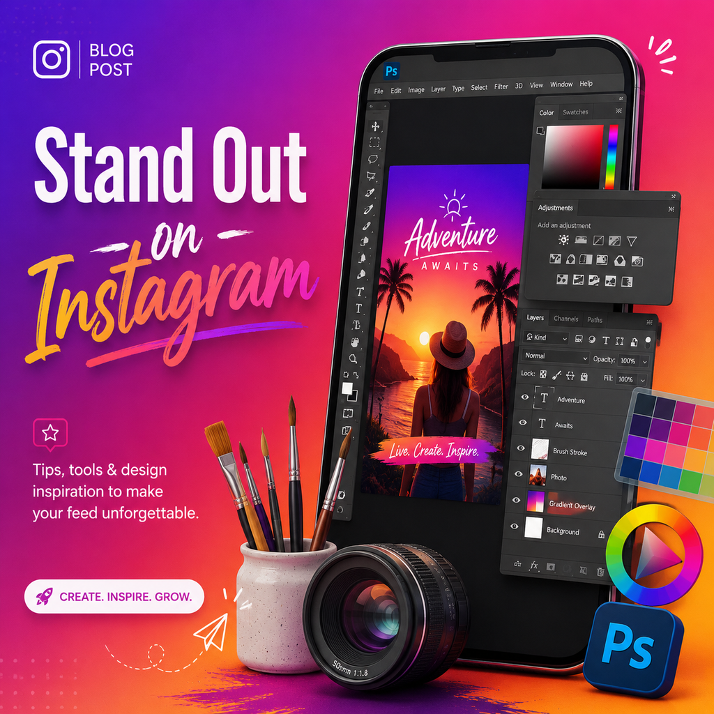
Building Custom Graphics and Shapes
To truly be unique, incorporate original graphics and shapes that complement your photographs. Use the Shape tools and Pen tool to create geometric or organic elements — think circles, abstract blobs, or watercolor-style brushes. Layer these with your photos, allowing white space to flow through the design. Combine large, soft shapes with more defined vector elements to create depth and visual interest. This approach gives your Stories and feed posts a handmade, artistic feel that sets you apart from stock template users. Save your custom shapes as presets for reuse, streamlining your workflow.
Using Adjustment Layers for Mood
Adjustment layers like Curves, Selective Color, and Color Lookup tables allow non-destructive editing, meaning you can tweak the mood of your imagery without permanently altering the original. Create a Curves adjustment to boost contrast subtly — pull the shadows down and highlights up for a snappy look. Selective Color lets you fine-tune individual color channels, such as deepening reds or cooling blues. For a fast, cohesive edit, try loading a custom 3D LUT (Lookup Table) via a Color Lookup adjustment layer. This can instantly apply a film-like grade that makes your feed look curated and professional.
Sharpening for the Mobile Screen
Instagram’s mobile-first platform requires images that look crisp on small screens. After resizing your image to 1080px wide, create a merged layer (Ctrl+Shift+Alt+E) and convert it to a Smart Object. Then use Filter > Other > High Pass with a radius of 1-2 pixels, setting the blend mode to Overlay. This sharpens details without creating artifacts. To avoid over-sharpening backgrounds or smooth skin, add a black layer mask and paint with white only over key areas like eyes, text, or product edges. For extra pop, apply a second sharpening pass with a higher radius (3-4) for specific details.
Exporting to Beat Compression
Instagram compresses images to save bandwidth, but you can minimize quality loss with the right export settings. Use File > Export > Export As and choose JPEG format with a quality between 70-80%. Check “Convert to sRGB” and ensure width is exactly 1080px. Lowering the quality slightly actually helps prevent Instagram from applying additional compression, as the baseline is already reduced. This trick keeps your images sharp and colors vibrant. For desktop uploads, use a browser’s developer tools to toggle device mode and upload directly, avoiding mobile compression entirely.
Creating Cohesive Story Templates
Stand out in Stories with branded templates designed in Photoshop. Start with artboards at 1080x1920px and apply your color palette. Add background shapes, photography placeholders, and text areas for messages. Play with text sizes — from bold headlines to small, secondary notes — to create hierarchy. Use masks to integrate photos seamlessly into your graphics. A set of 5-10 templates ensures your Stories look consistent, professional, and uniquely yours. By mixing flat vector elements with imagery, you achieve a polished, editorial feel that resonates with audiences looking for authentic creativity.