

 Русский
 Turkish
 Português (Brasil)
 한국어
한국어 العربية
 Español
 ไทย
ไทย Tiếng Việt
 Français
 中文
中文 Deutsch
 Bahasa Indonesia
 Italiano
 日本語
日本語 Polski
 Українська
 فارسی
فارسی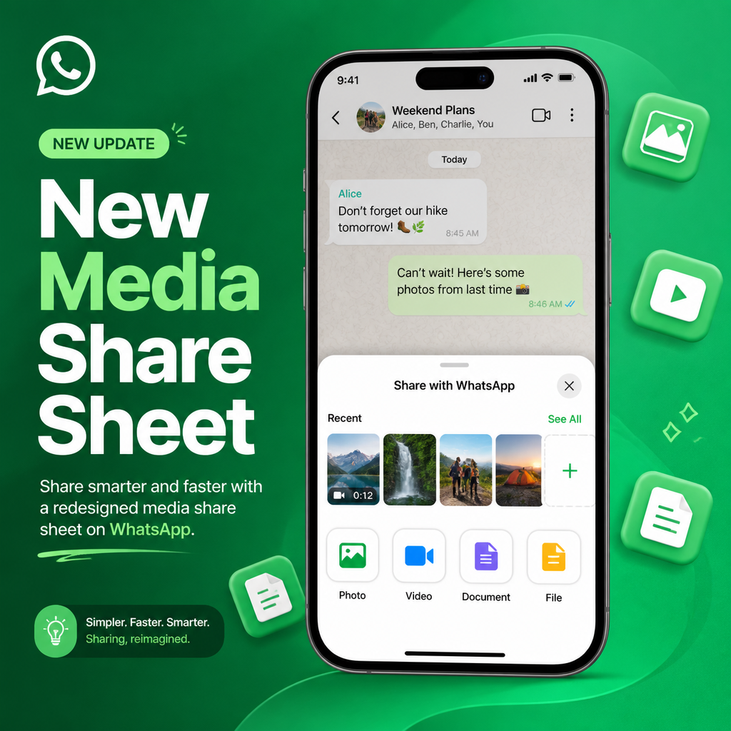
WhatsApp's New Media Share Sheet: A Quick Look
WhatsApp is rolling out a redesigned media attachment sheet on iOS, giving iPhone users a faster, more intuitive way to share photos and videos without ever losing sight of the conversation. The updated interface, spotted by WABetaInfo, is now appearing for select users on WhatsApp for iOS version 26.19.75, signaling a shift toward more streamlined, chat-centric media sharing.
Gone are the days of navigating a full-screen gallery just to send a quick snapshot. With this update, WhatsApp is putting your most recent media front and center, right inside the attachment sheet, so you can pick and send in a couple of taps—while still seeing your chat thread in the background. It's a small change that makes a big difference in daily messaging flow.
Why the Old Way Was a Hassle
If you've used WhatsApp on iPhone, you know the drill: tap the plus button to open the share sheet, then tap into Photos to browse your entire library. That view takes over the whole screen, momentarily blinding you to the conversation you're trying to respond to. It's functional but clunky—especially when you just want to share that screenshot you took moments ago.
The new design addresses this friction head-on. Instead of a full-screen detour, recent photos and videos now appear within the attachment sheet itself, keeping the chat visible in the background. It's a subtle but significant shift that prioritizes context and speed, aligning with how we actually share media—impulsively and in the moment.
Inside the Redesigned Share Sheet
The centerpiece of this update is a new recents section. When you tap the plus button, you'll see a compact 4x4 grid of your latest photos and videos, arranged horizontally so you can swipe through them quickly. This grid sits right below the usual share menu options like Document, Poll, and Event, making it the first thing you interact with.
But the convenience doesn't stop there. If you swipe to the end of that strip and still haven't found what you're looking for, WhatsApp automatically expands the view to reveal your full media gallery—no extra taps required. It's a seamless escalation from quick picks to deep browsing, tailored to how much context you need. For those who like shortcuts, you can also press and hold the plus button to summon the picker directly, skipping a step entirely.
Faster Sharing, Less Friction: Benefits in Action
This redesign isn't just about looks; it's about cutting down the steps between thinking "I want to send this" and actually hitting send. With the recents section, you can attach a photo in as little as two taps: one to open the sheet, one to select the media. Compare that to the old flow, which could take four or five taps and a full-screen detour.
- Stay in context: The chat stays visible, so you can reference messages while picking media.
- Quick access: Recent files are always at your fingertips, reducing the need to dig through your library.
- Seamless expansion: Scrolling through the grid nudges the interface to expand, so you're never stuck if you need older files.
- Shortcut support: Long-pressing the plus button brings up the picker instantly.
These tweaks might sound minor, but they compound into a noticeably smoother sharing experience, especially for power users who send media all day.
Testing Phase: Not Everyone Has It Yet
As with many WhatsApp features, this rollout is gradual. The redesigned sheet is currently visible to a subset of users on the latest iOS build (26.19.75), but not everyone who updates will see it immediately. This staggered approach is typical for WhatsApp, which often tests new interfaces on a small scale before a global push.
The fact that it's appearing in a stable release suggests the feature is fairly polished, but WhatsApp is likely monitoring performance and user feedback before flicking the switch for everyone. If you've updated and don't see the new sheet yet, don't worry—it's probably just a matter of time before it lands on your device.
Design Language: A Nod to Apple's Liquid Glass
Notably, the new interface appears to align with Apple's Liquid Glass design language, which will define iOS 26. The share sheet's translucent, dynamic elements and fluid animations hint at deeper integration with Apple's ecosystem. This isn't just a functional upgrade; it's a aesthetic one that brings WhatsApp in line with the visual direction of modern iPhone apps.
By adopting these design cues early, WhatsApp is positioning itself as a forward-thinking app that embraces platform conventions, which could lead to a more cohesive user experience across the iPhone. It's a smart move that keeps the app feeling current and native.
Looking Ahead: What This Means for WhatsApp's Future
The redesigned media share sheet is more than a convenience—it's a signal of WhatsApp's broader design philosophy. The app has been steadily modernizing its interface, from chat bubbles to dark mode, and this update continues that trend. The focus on keeping the chat visible during media selection suggests WhatsApp is doubling down on conversation-centric features, making the chat the hub of all interactions.
As the rollout expands, expect this feature to become a staple for iPhone users, potentially paving the way for similar improvements on Android or in WhatsApp's other platforms. For now, if you're on the latest iOS version, keep an eye out for the new layout—it's a welcome refresh that makes sharing feel effortless, and a glimpse into how WhatsApp is evolving to meet the needs of its users in a fast-paced messaging world.